Visualizing the health conditions of neighborhoods in NYC
#DataVisualization
#UX
#SocialEquity
Team
Sarah Williams, Ashley Louie, Esther Kim
Role
Research, Lead Data Visualization Design, Data Selection and Parsing, UX
For
Center for Architecture NYC, AIA NY
Sarah Williams, Ashley Louie, Esther Kim
Role
Research, Lead Data Visualization Design, Data Selection and Parsing, UX
For
Center for Architecture NYC, AIA NY


Resoures and opportunities are the fundamentals of good health, including secured jobs with benefits, well-maintained and affordable housing, accessible transportation, healthy and affordable food, and quality of education and health care, which are distributed inequitably throughout NYC.
Neighborhood Health highlights the issues of health inequities and resource disparities in New York City by providing the indexical value of factors from demographic, socioeconomic to housing and neighborhood infrastructural on borough at community district level.
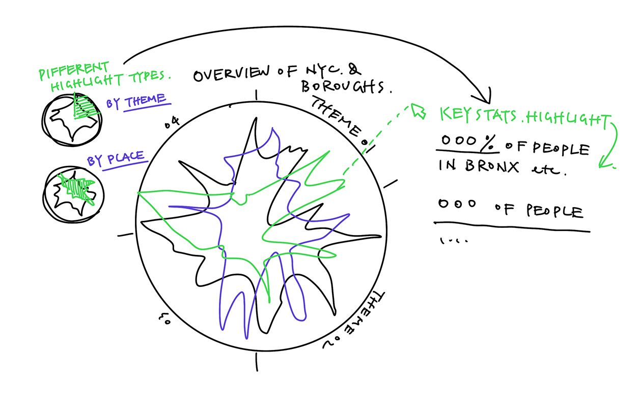
Using a radar chart method, an unique shape is given to each community district to visualize the hidden gaps and patterns of unequal distribution of resources and opportunities that contribute to health burden and differences in life expectancy.
Research
NYC has community healthy profiles of each community district. The “health” of each discrict is determined by factors from four overarching catagories:1) Demographic Conditions
2) Social and Economic Conditions
3) Housing and Neighborhood Conditions
4) Maternal, Child, Mental, Physical Health, Health Care, etc
What’s the percentage of homes with AC? What’s the air pollution level of the community? Is there bicycle network around the neighborhood? How many people have health insurance? The detailed criteria suggests a way of understanding the inequities and resource disparities of NYC.


Data Visualization & UX Design
Goal
There are already detailed breakdowns and comparisons in each report of the 59 community districts; but the information is too heavy and too distributed.
The data visualization of this section is to take the complicated dataset from all over the place together, analyze, rescale, and create a comprehensive graph of factors from the four perspectives that we considered as most relevant to the “health” of neighborhoods and the future NYC.
Data
The metadata for neighborhood health comes from 2018 Community Health Profiles Public Use Dataset. The data compiles many sources such as from American Community Survey (ACS), NYC Department of Health and Mental Hygiene (DOHMH), Community Health Survey (CHS) indicators, New York University (NYU) Furman Center and NYC Housing and Vacancy Survey (HVS) indicators which have been modified to reflect Public Use Microdata Area (PUMA).
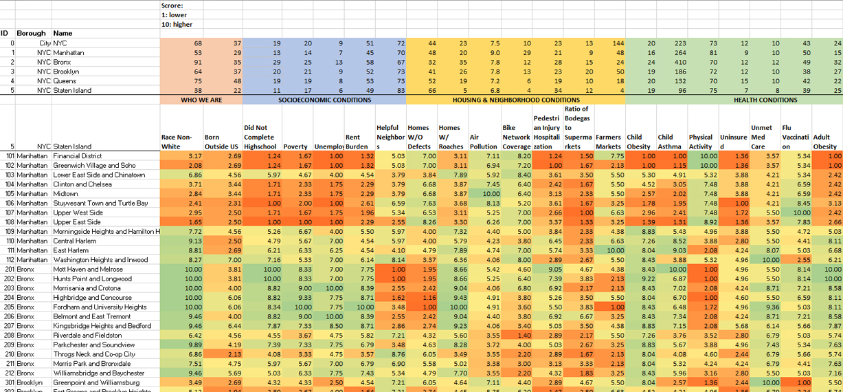
For the purpose of this visualization, the factors such as poverty, unemployment, rent burden, homes with roaches, bike network coverage, unmet medical care, child asthma, and more were selected and scaled to a score of 1 to 10.
Raw Data
![]()

Selected & Rescaled Data
![]()

Data Visualization Design
In considering of the complexity, a spider web is chosen as the basic format to represent such large amount of data.


UX Design
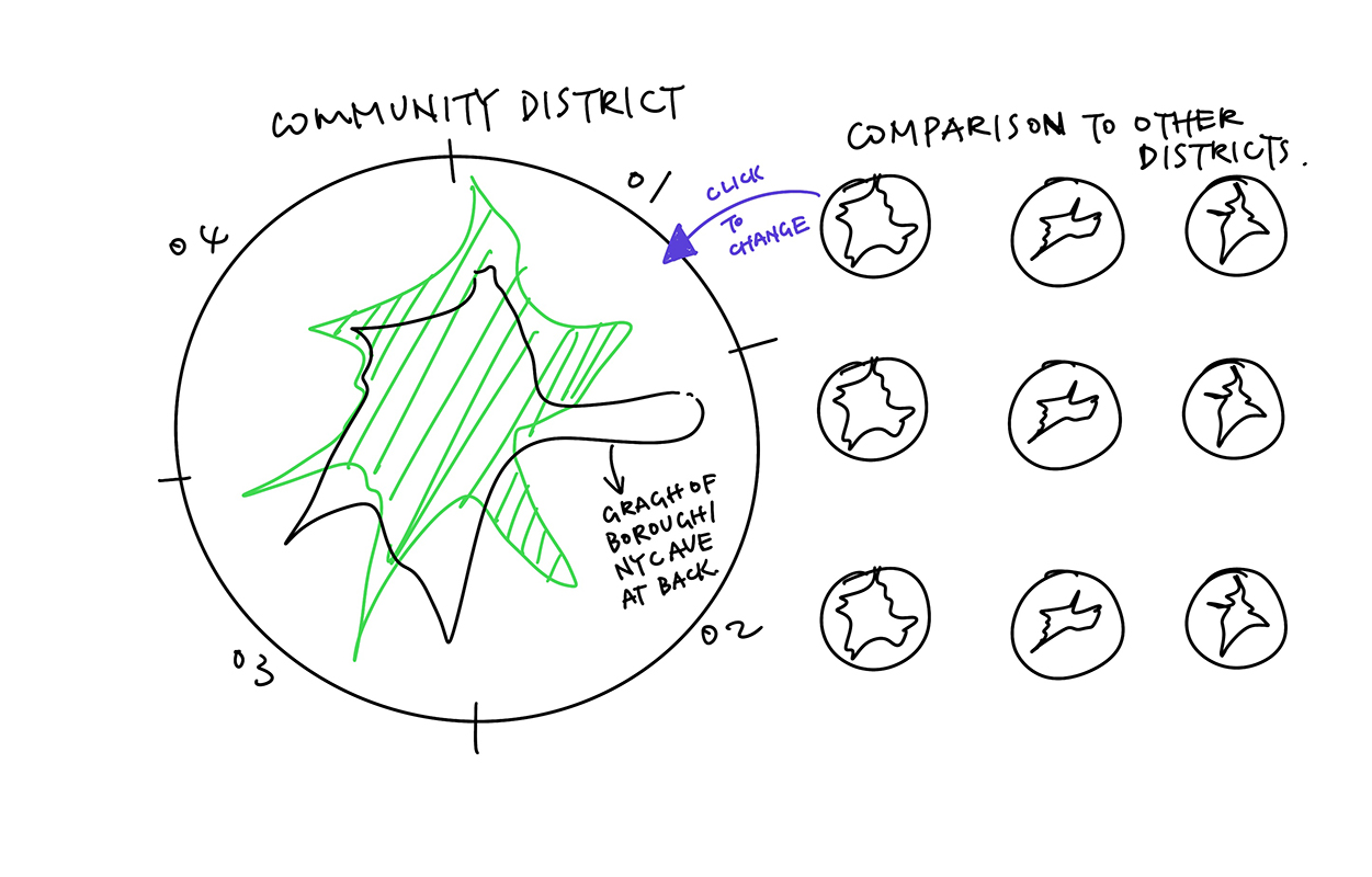
In response to the heavy information and complexity, the flow of visualization intends to be simple for user to navigate and at the same time provide audience with the opportunity to compare the differences and to see the disparities in NYC.

Outcome


